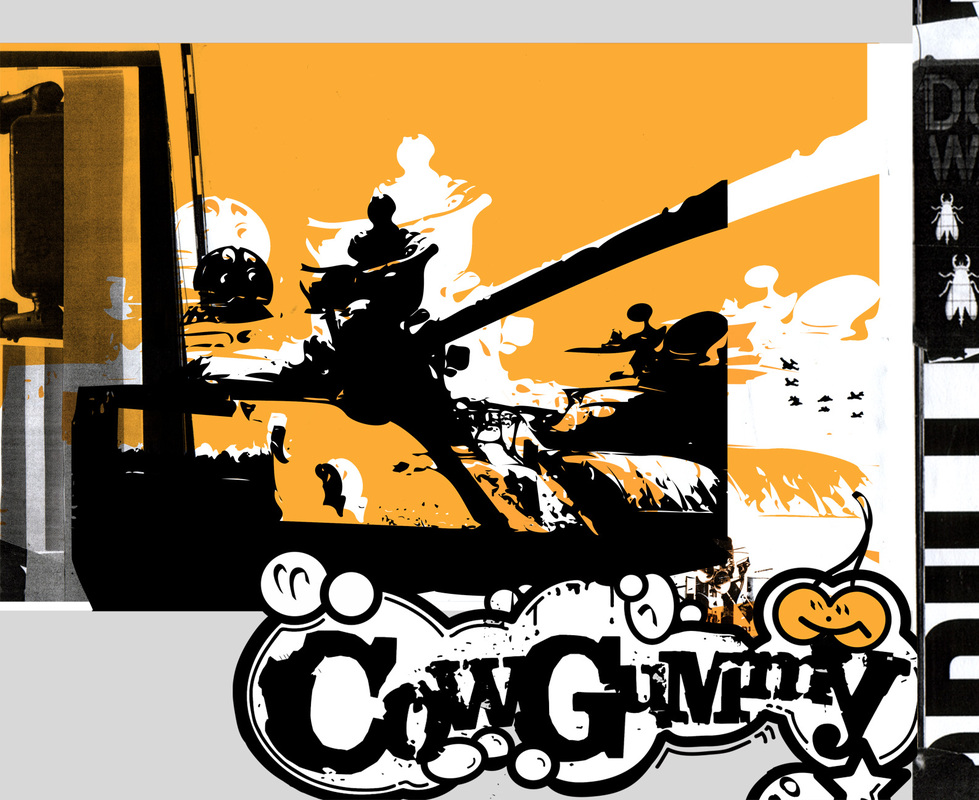
The above design was made to catch the eye of this artist's potential customers through use of contrasting colours (black and white) and vibrant hues. This composition is unbalanced; its components are placed sporadically, and do not create a balance. The design uses a serif font.
To make the design high contrast, the designer probably used a high-contrast filter on a photograph or image initially in Photoshop, traced parts of the image with the colours they've chosen, bumped up the contrast in Photoshop, cleaned the design up, and added a logo.
To make the design high contrast, the designer probably used a high-contrast filter on a photograph or image initially in Photoshop, traced parts of the image with the colours they've chosen, bumped up the contrast in Photoshop, cleaned the design up, and added a logo.
