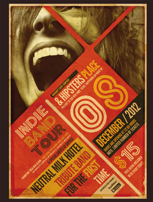
The above design, an advertisement for a music concert, is attempting to catch your eye with varying shapes and sizes of text. The colour palette is comprised mainly of subdued, warm hues such as red, orange, yellow, and brown. The colour choice creates a nice colour harmony, balancing tertiary, secondary and primary colours. I believe this advertisement was created in the 2010's. Although the images draws inspirations from prior decades, the choice of photograph and creative font gives the advertisement a fresh, new-age feel. The two font families used are important to this design. One family is used to catch the viewer's eye, and the other is used to deliver important information. Without that balance, information could easily be missed due to the font family being unreadable, or the advertisement could easily be ignored due to a lack of visual interest. I feel like the tint works well with the rest of the design, it continues the colour harmony in the rest of the piece. I feel like a different tone would work better with this design, like a more subdued yellow, or even a light grey.
