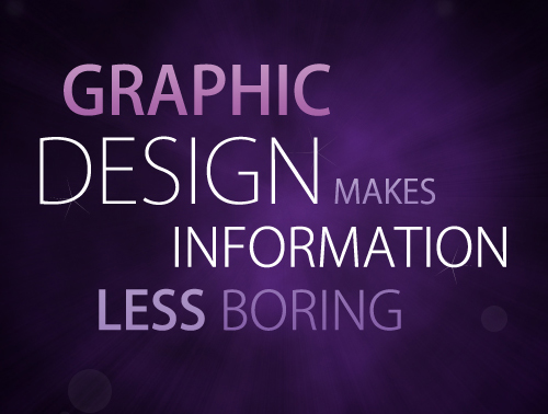
The above design is attempting to give viewers an understanding of graphic design, and why it's an important aspect in advertising, art, and business. The above design uses a dark purple hue, as well as various shades and tones of purple. To contrast, 'design' and 'information' are scribed in a clean white. The composition is asymmetrically balanced, since the text is equally spread out along the image and creates a balance. The above design uses a sans-serif font. Serif fonts are better for the printed word, and sans-serif fonts are better for words on the web. Both of these choices are based on visibility to the human eye.
