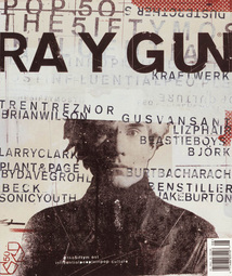
by David Carson
Carson's piece in Ray Gun magazine has an astounding artistic presence. Carson's palette in this piece consists primarily of warm hues like red and brown, which gives the piece a unifying element that is appealing to the eye. Both dark and light values are used in proportion to achieve balance within the piece. Carson also uses texture wonderfully, as shown by the grainy texture of the model, and the variation in the text on the cover. Shape is also a big part of Carson's design, since he chose an image of the model that was very flat. This choice was probably made to bring depth and life to the text in the image, and to catch a viewer's eye. Many companies focus solely on having their model seem as close, personal and realistic as possible, and Carson's choice is a lovely contrast.
