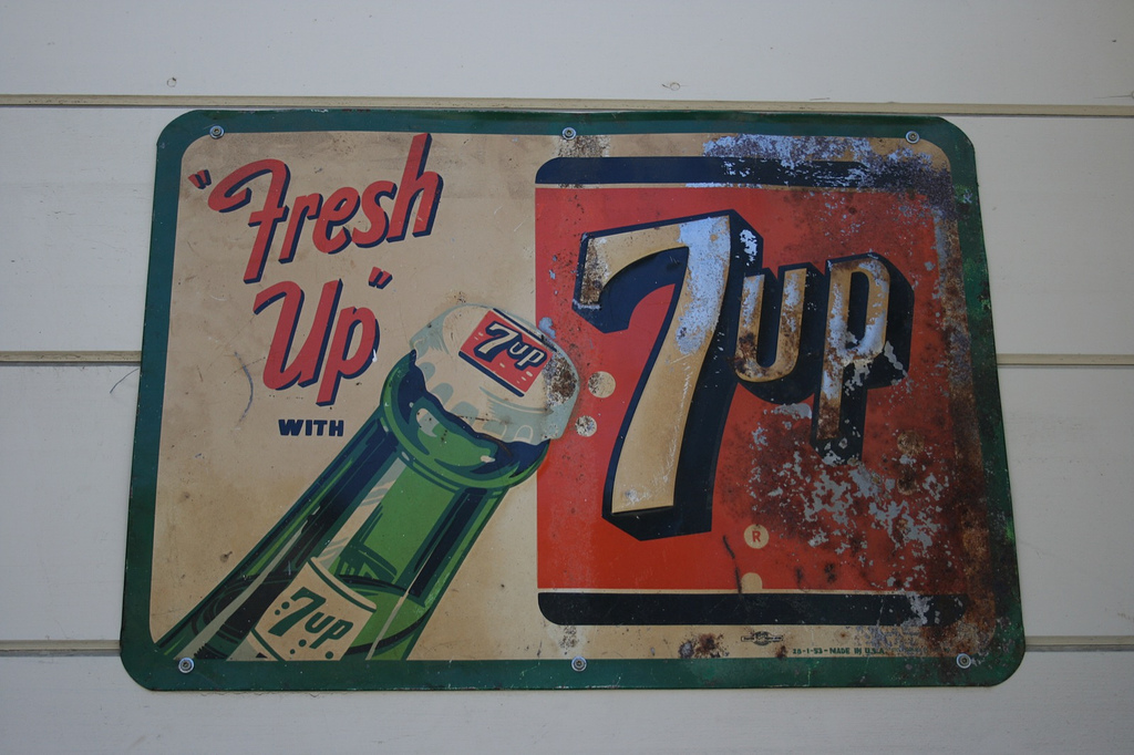
The above advertisement was created for popular beverage brand 7UP. Through use of catchy slogans and clever design, the advertisement is attempting to coerce viewers into buying 7UP brand soda. The green border and bottle contrast with the red logo and text, since red and green are complementary colours. This creates a vibrant, eye-catching colour harmony within the advertisement. This design is asymmetrically balanced; the cap of the 7UP bottle is the center point. To balance out the large logo, the bottle and text were placed so they would take up a near-equal amount of space. Judging by the severity of the rust on the sign and the product's name, I would assume it was made around 1950.
7UP, originally named Bib-Label Lithiated Lemon-Lime Soda, was created by the Howdy Corporation in St. Louis in October of 1929. The name was revised to 7UP due to the use of seven unique flavours in the carbonated beverage.
7UP, originally named Bib-Label Lithiated Lemon-Lime Soda, was created by the Howdy Corporation in St. Louis in October of 1929. The name was revised to 7UP due to the use of seven unique flavours in the carbonated beverage.
