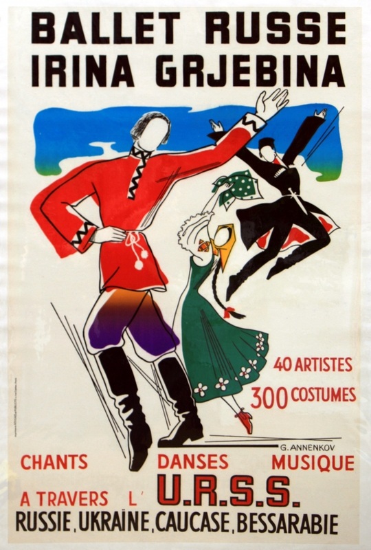
The above design is a graphic attempting to sway its viewers into attending the Ballet Russe, through use of vibrant eye-catching design, and persuasive language ('40 artistes' and '300 costumes' being prime examples of this tactic; by mentioning these details, viewers equate quantity with quality and assume the ballet is of a higher quality.)
This composition is balanced asymmetrically. The figures are all placed in a strategically sporadic manor; the two smaller figures on the right of the design reach the same height as the larger figure on the left. Additionally, the smaller figure in the green dress is offset to the left of the smaller figure in the black coat. Their placement creates an arc to the right, which directly mimics the figure in the red coat's arc to the right.
This composition uses sans-serif font.
Based on the vibrancy of the design's colours and the lineart's thin edge, I can make a hypothesis that the artist used either gouache and ink, or that the piece was created digitally.
