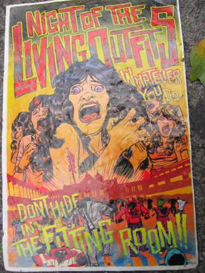
The above graphic is a sidewalk card attempting to draw in viewers by imitating popular media, in this case George Romero's 'Night of The Living Dead'. Through the use of contrasting red and green text, the advertisement effectively draws attention to the card's illustrations. The card shifts from using more low-intensity colours up top to using more high-intensity colours on the bottom. Using such a tactic catches the viewer's eye and gives them multiple points of interest. Given the high interest in zombies and the living dead that occurred from 2010-2012, plus the card's texture and location (New York) I'd assume this card was made somewhere in that two year range. The font family used on the above card is very important to the design. The text, usually reserved for use in horror films, helps set the mood of the design. The font's emphasis on capital letters brings visual interest to the card. The font family used is also important since it makes the vital connection between 'Night of The Living Dead' and the design.
